AURAL MUSIC STREAMING APP


THE PROJECT
There is an abundance of choices on the market when it comes to choosing a music streaming service. My take on a music streaming app is to seamlessly integrate social media tools. This results in a streamlined experience that is ideal for those who want to share their music and playlists with friends, followers, or family quickly. While the general purpose is similar to the experience of using Spotify or Apple Music, the added unique flows of Aural are ideal for a more social media/tech-savvy user base. This project involves heavy research and a design process, split up into five different phases:
1: Market and user research, personas, and the user journey
2: Napkin sketches and wireframing
3: Prototyping and low-fidelity user testing
4: High-fidelity UI and design systems
5: Interactive prototype and user testing
PHASE ONE
USER INTERVIEWS
I gathered three interviews verbally from music listeners ranging in their teens to their thirties. They are from diverse backgrounds and professions and use their music streaming apps differently, highlighting their favorite and least favorite features.
Users:
Zack | 23 | musician
Bo | 36 | corporate executive
Hannah | 20 | public health student
Questions:
-
What is your favorite music application and what device do you use?
-
How often and what time of day do you use the app?
-
What's most appealing about it?
-
What's the hardest part about using it?
-
Was there anything surprising or unexpected about the app?
-
What can be done to improve the app?
-
What feature do you use the most?

COMPETITIVE ANALYSIS SUMMARY
Because all of my interviewees happened to use Spotify as their music app, I chose it to conduct a competitive analysis summary on.

COMPETITOR USER FLOW MAP: SPOTIFY
A hand-drawn user flow map consisting of main tabs, buttons, pages, etc.

VALUE PROPOSITION
After my research, I wrote a value proposition keeping the following questions in mind:
What were some of the frustrations that my interviewees experienced when using their music apps? What are some of the things I would specifically like to improve when designing my own app? What type of audience would I like to focus on when designing my own app?
The main frustration my interviewees faced when using Spotify is the hard-to-navigate interface when trying to find certain features. This includes finding the yearly rewind and "top listens" feature and the ability to separate different users on one plan/account. Both interviewees concluded that in a fast-paced world, taking time to scour these features is out of the question for them, desiring an easier interface that takes the guessing out of it. Something I’d like to improve on for my own app is making it more social media-friendly. Many don’t realize they have some of those features, like Spotify QR codes, and I’d like to make the interface more intuitive. In general, I want to create a seamless experience for people to listen to music quickly, rather than taking extra steps or time on their phone to get to things (whether it’s to add to a playlist or adding to their queue). The type of audience I’d like to focus on for the app is a younger crowd, particularly the Gen Z and Millennial generations.
In a world heavily influenced by the connectivity of social media, music streaming services lag behind on important sharing features, the quality that makes my music app stand out from all the others. My app’s purpose is to reach out to this demographic and provide features that are integrated seamlessly into popular social media apps for users, friends, and family to stay connected. Since most of these consumers are also faced with shorter attention spans due to the fast-paced world of posting videos and memes, users will find that my app is more intuitive and quicker to get around than others, leaving more time for them to enjoy listening and sharing with their circles.
PHASE TWO
USER PERSONAS
I created three user personas using the interviews I gathered in Phase One. The three personas were created in Figma and are fictional people.
NAPKIN SKETCHES
In this step, I mapped out the user flow of my app like I did with Spotify in Phase One by hand.

LOW-FIDELITY WIREFRAME
In Figma, I wireframed the different pages of my app, following along with the user flow I sketched out in the previous step. The design of my app pages is crude in order to focus on the foundational fundamental aspects of my user flows.
PHASE THREE
INTERACTIVE PROTOTYPE
For the first step of Phase Three, I had to prototype the following three flows: log into the app/create an account, add or remove a song from a playlist, and my unique flow (the social media aspect of my streaming app).
USER TESTING
Next, I had to come up with user testing questions and send two people the prototype link to test and record their answers.
Users:
Nguyen/Ahn | graphic design student
Danielle | graphic design student
Flows:
-
Log in to app or create an account
-
Add or remove a song from a playlist
-
Unique flow (socials page)
Questions:
-
What do you think of the main page of the "socials" tab? While this is a low-fidelity wireframe, is there still a way I can improve the design and make it more engaging?
-
Were the ">" buttons on the sign up/log in pages too large?
-
Do the adding/removing songs flow make sense (they're located in two different areas of the app)?
-
Do I have enough content for my unique flow or should I add more?
-
Any other suggestions for my overall layout?

DATA ANALYSIS & WIREFRAME UPDATES
After testing my users with my low-fidelity prototype, I analyzed my collected data to add updates to my prototype.

PHASE FOUR
MOODBOARD
First in Phase Four is to put together a moodboard to help visualize and conceptualize the direction I want my app to take. From there, I developed my design system in the next step.
DESIGN SYSTEM
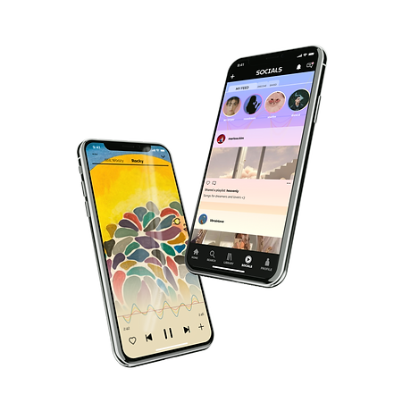
For the design system, I used two fonts, MuseoModerno and Raleway. The colors consist of a bright rainbow gradient seen throughout the app.
HIGH-FIDELITY USER INTERFACE PROTOTYPE
The bulk of this project was dedicated to designing and prototyping the entire music app, with all of the following required user flows, components, and screens:
Flows:
-
Log in to app/create an account
-
Search for a song, album, or artist
-
Play, stop, pause, fast forward, and rewind a song
-
Create a playlist
-
Add or remove a song from a playlist
-
Share a song with a friend
-
Add a song to a favorites list and access the list or edit it
-
Browse new releases and top charts, and add selections to a playlist
-
Access song details to view an album
-
Access profile to update username, email, or contact info
-
Unique flow
Components and Styles:
-
Calls to action, buttons
-
All icons
-
All colors
-
All font styles
-
Modals or dialogs
-
App bars
-
Bottom nav bars
-
Image lists
-
Chips (optional - extra credit)
-
Banners
-
Snackbars
-
Selection controls
-
Tabs
-
Sliders
-
Progress indicators
-
Music players
-
Inputs (form or text fields)
Screens:
-
Loading
-
Log in/sign up
-
Create account
-
Browse
-
Home
-
Search
-
Playback - minimized
-
Playback - full screen
-
Song options
-
Artists
-
Albums
-
Artist detail
-
Album detail
-
Categories
-
Playlist
-
Settings
PHASE FIVE
USER TEST PREP
Phase five is similar to phase three, except I will be testing out a completed app on people who are unfamiliar to the project. I came up with five questions and three users to interview for the following flows: sign up, play a song, and add a song to a playlist.
Users:
Jemima | 20 | graphic design student
Hannah | 20 | public health student
Zack | 23 | musician
Questions:
-
Can you tell me what you think of my icons? Do they make sense?
-
How did you find the experience of using the app to add a song to a playlist?
-
What did you think of the layout of the content?
-
How was the experience of signing up for an account?
-
What do you think of the design of the music player?
USER TESTING
Next, I interviewed the testers after they completed the three required flows of signing up for an account, playing a song, and adding a song to the playlist. The following is the data I recorded:

DATA ANALYSIS & UPDATES
The final step was to analyze my collected data and apply that to an updated version of the flows to another Figma file. As a whole, the users understood the flows, but didn't understand the difference between a prototype and a fully-coded app. I explained that not every button has its own personalized page/content, and the text fields aren't typeable. Other than that, they commented on its ease of use and familiarity to apps like Spotify and Soundcloud. I applied some of the feedback to my updates, like adjusting the smart animations and adding in a button to create a new playlist directly from the "add to a playlist" button on a music player. This was previously only available on the playlists tab under library.