HITCHHIKE
APP


THE PROJECT
HitchHike is my solution to the transportation problem people are faced with. I created this with a younger demographic in mind, specifically, college students or young adults without cars to rely on with long-distance travel.
Since ride-sharing apps are not a cost-effective solution for young adults, HitchHike takes a non-profit approach to this by acting as a message board connecting users to each other.
1: Market and user research, personas, and the user journey
2: Napkin sketches and wireflows
3: Prototyping and low-fidelity user testing
4: High-fidelity UI and design systems
5: Interactive prototype and user testing
[Section updates in progress]
PHASE ONE
USER INTERVIEWS
I gathered four interviews verbally from people in their twenties with long-distance travel issues.


USER PERSONAS
I created three user personas using the interviews I gathered in Phase One. The three personas are fictional people.

PHASE TWO
WIREFLOW SKETCHES
In this step, I mapped out the user flow of my app.

LOW-FIDELITY WIREFRAME
In Figma, I wireframed and roughly designed the different pages of my app, following the user flow I sketched out in the previous step. The design is crude in order to focus on the foundational fundamental aspects of my user flows.
PHASE THREE
INTERACTIVE PROTOTYPE
I prototyped the following three flows on my low-fidelity wireframe: log into the app, create an account, and open a message.
USER TESTING
Next, I wrote user testing questions and recorded their navigation.
[TO BE ADDED]
PHASE FOUR
BRANDING
My approach to the brand is to keep it youthful, bright, and modern. I opted for an orange and purple color combination and approached a minimal, yet fun, illustrative style.
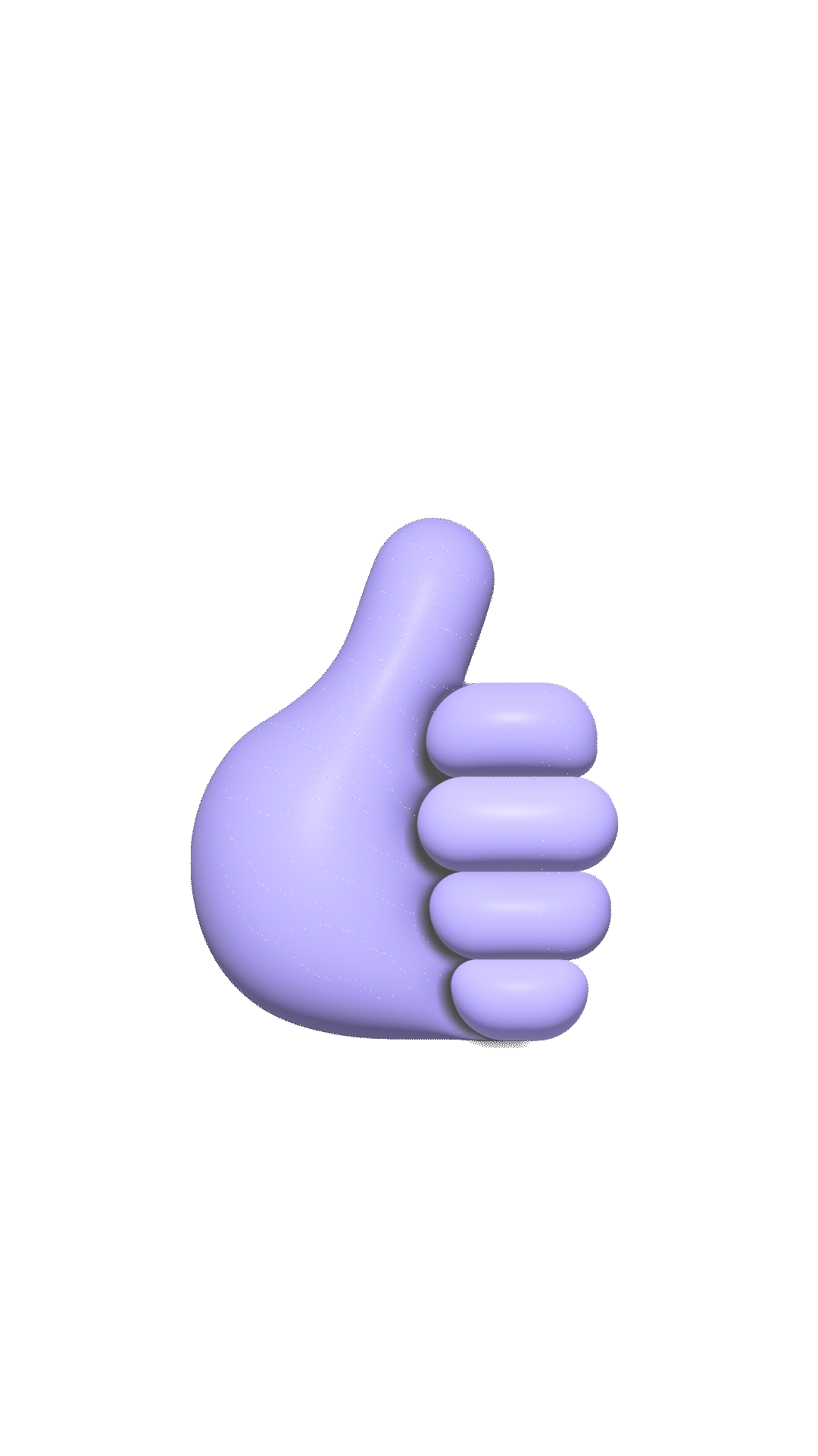
I wanted the iconography of HitchHike to feature a thumb to represent how hitchhikers signal to passersby. I finalized a flat style and experimented with a 3D style for the app icon. For the logotype, I altered the typeface and added a purple arrow to unify the branding and to reference the purpose of the app: traveling. I also animated a load-in screen, inspired by Uber.


DESIGN SYSTEM
HIGH-FIDELITY USER INTERFACE PROTOTYPE
PHASE FIVE
USER TESTING
For this phase, I came up with five questions and three users to interview for the general app navigation.
[TO BE UPDATED]
Users:
Questions:
-
Can you tell me what you think of my icons? Do they make sense?
-
How did you find the experience of using the app to create a post?
-
What did you think of the layout of the content?
-
How was the experience of signing up for an account?
-
What do you think of the overall design and is there anything that seems missing or out of place?
DATA ANALYSIS & UPDATES
The final step was to analyze my collected data and apply that to an updated version of the flows to another Figma file. [TO BE ADDED]